All images 8" x 8" painted papers on watercolor paper 12" x 12" with yarn and machine stitching In going through my studio journal for June, I came across these questions/ideas:
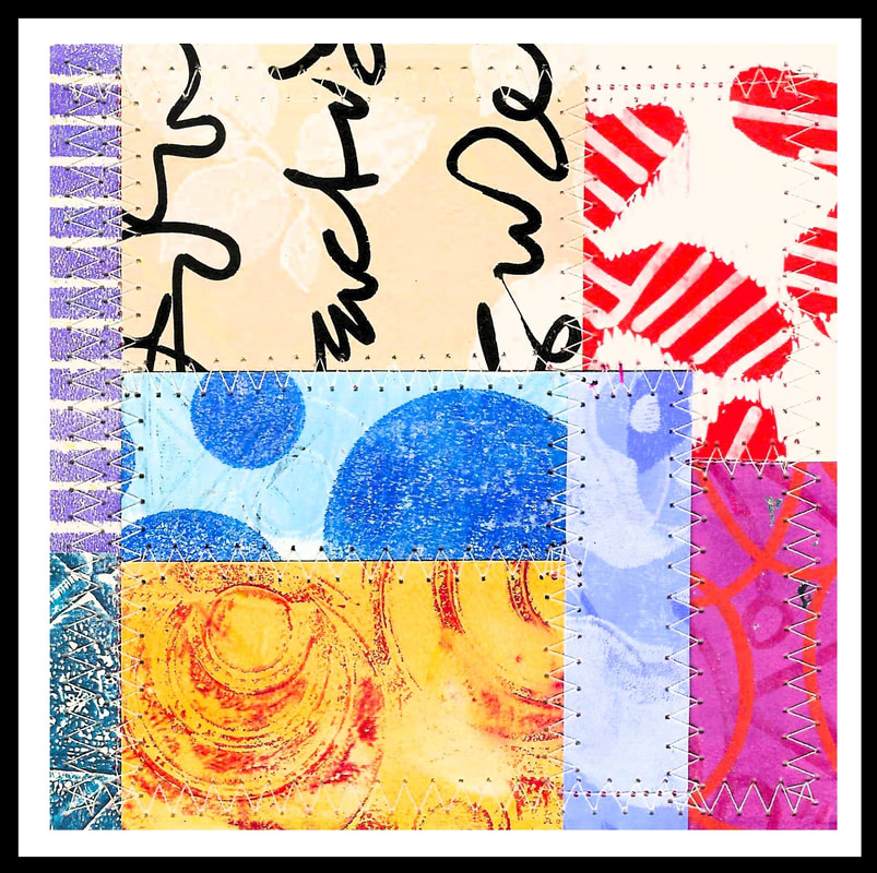
* Is there a way to use yarn and machine stitching together to kind of "batten down" the collage pieces? (I like what the machine stitching does to organize everything and make it look neat and clean.) * Amish "Chinese coins" idea. " Is there a modern day equivalent of the embroidery sampler concept? (And do women need such a thing anymore, anywhere?) * Embroidered circles, intertwined yarb/stitching. * Finished collages need adjustments just like a painting: adjust lights and darks, chroma, point of interest, balance from all sides, hierarchy, direction, etc. * Soft cover binding versus hard cover binding; coptic stitch difficulties. * Soft paper versus hard paper for coptic bound notebooks. _____________________________________________________________________________ I would say that if you have any interest in keeping track of what you actually do in your studio, journaling would be a good idea. I am sure people do this online or with their phones but I am way old school about this. I have been keeping a sketch book /journal since I started making art. I can't think of a single thing during this whole time that has served me better in terms of keeping track of the trajectory of my art making experience. I can go back (and have done so) to re visit ideas and experiments, to see what influences came to me, and to remember highs and lows that really did help me grow. (The only thing that might be as important is to revisit old art work.) But for sheer helpfulness that is immediate and direct, a journal just can't be beat. And at the end of the day, long after I have tossed work, I still have my sketchbooks to show what I have been thinking and doing. The one really important idea that came through very loudly this past month is what the machine stitching does for me. The collage itself is not glued in any way. The glue makes the papers buckle which I find tedious and unacceptable. You can flatten things between two heavy objects but, see above-tedious! I use tape on the back of the papers to put the pieces together (no buckling) and to affix the finished piece to the WC paper and board. Tape however, is not the same as glue in terms of being able to organize all of those loose pieces. Glue flattens out paper onto a substrate. Tape really doesn't do that in the same way. In any case, the machine stitching comes to the rescue. It really tamps the final collage down in all of the right spots just like the glue would have done, only without the nonsensical machinations needed to keep the paper flat and wrinkle free. Incidentally, all of these collages that I have shown this year use what I call a dry process. Glue is a wet process as are things like using matte medium, glue sticks and varnish. When I made collages with strictly solid color paper or printed paper (all varnished with sealant) and glued them to a painted and sealed matboard, I considered that to be a wet process. Any time moisture is introduced to a collage, I consider that to be a wet process. In using these mono printed papers, I switched over to a dry process to avoid buckling. (Buckling really occurs because there is a disparity in the match up between the paper and the surface it is being glued to. The disparity comes in terms of moisture differences or tension differences or something along those lines.) The papers are still varnished for protection from UV rays but they go together with tape which is dry. I guess I have strong feelings about the glue situation. I have spent a very long time testing out what works for me and figuring out what I find acceptable in terms of results. Despite being a bit sloppy in areas of my life, I really appreciate neatness, cleanliness and precision in artmaking. I fall very short of my ideals but am generally satisfied with how things look. I suppose you have to pick and choose where you are going to put your efforts. Alright! Let me know about these new pieces via email: [email protected] And if you use a journal, I want to know about that too! Thanks, Libby  Sew, Quilt, and Weave 4 8" x 8 " matted to 12" x 12" Hand printed and painted paper, cotton yarn, machine stitching I finished this piece up yesterday. It was kind of a "sideline" piece since I was working on something else already. But I had seen on FB an Amish style coins quilt that my friend had done and I was really taken with the layout. Over the years I have gravitated towards Amish style quilts with their bold colors, graphic elements, and simple layouts. They are complex looking without being complicated, if that makes sense. I felt that the concept of that quilt layout I saw would translate well to a collage. To get started, I had some "strip pieced" scraps on my work table and I used those to begin the piece. Funny too about that strip pieced bit of papers. It's amazing that collage and working with paper can be very similar to making a quilt. I can apply some concepts from quilt making, such as using a 1/4" seam and strip piecing, to put pieces of paper together. My finished pieces, too, are very much like making a "quilt sandwich" only with paper instead of fabric and batting. I really like that I can take things that I already know and use them in new ways to move my current work forward. However, not every inspiration, such as this Amish style quilt, is such a direct transfer. The one thing that I have shied away from in these quilt inspired pieces is any kind of a border. To me, adding a traditional looking border just looks too "quilty". I don't want these pieces to literally be paper quilts. I want the pieces to reference rather than replicate. But, I wanted something to somewhat frame the collage because I knew I was going to add the yarn. I remembered an artist that I used to love following (Laurie Fendrich) and she had lots of paintings which had a kind of "echo border". Very thin lines of color were used in repetition to frame the main figures. I felt that a thin line of color would be a great way to finish the collage and make room for that yarn idea. I think it works well in this case. Now, the yarn element. I have developed a sort of yarn fetish. It started with binding my collage books. Almost exclusively, the handmade books that I have seen are bound with a waxed or unwaxed linen floss. When I started with my first project I tried to use the floss. I hated it! Ack! I am vert tactile and the floss felt wrong to me. Yarn seemed a good substitute since I am also not super keen on embroidery floss. I took a deep dive into the world of yarn, learning some basic terms and trying to match materials so that yarn, needle and paper could all work together. I am happy to say that I now own some yarn! And some needles. And more yarn. Beautiful, rich colors too. What a wonderful medium. Anyway, I knew I wanted to use yarn in this piece and I envisioned a kind of blanket stitch only without the base. I want to say upfront that it is very scary to punch holes in the finished work. The collage is affixed to the watercolor paper and then affixed to the matboard. I then start punching holes to make the stitches. (I use a piece of graph paper as my hole punching guide.) I am sure that if I make a mistake I could do something to fix it but I also know that the solution might be to start over, which would be upsetting. It's not surgery but still. I feel that the finished piece looks contained and restrained. I chose a contrasting black and white yarn instead of a color. I think I could experiment with this because I am sure a color would work. I also think some kind of weaving stitch would be good. I just don't want to overwhelm the collage itself with the stitching. I want the stitching to be integrated and to not stand out as a separate element. It can be the focal point but not a separate thing. There are a lot of prints and colors too in the piece but I feel like the machine stitching and yarn stitching brings everything into focus and gives it a kind of control. I like art that seems organized in some way that I can understand. Anything really that has organization to it is a draw for me. I just gravitate to a kind of order in things. So, onward. I have some small collages in process. They are meant for a little 6" x 6" handmade book. I made the book out of a record album cover. I like the idea of re using materials. We had the record albums on hand (they are from quite another lifetime I would say). I actually made two of the books and they were really meant to help me practice stitching single pages into a book form. I hope to be able to photograph them at some point and add them to the site. Thanks for reading. Drop a line if possible. [email protected] Thanks, Libby Collage book, 7" x 7" with a sampling of the completed collages 5" x 5" (14 in all) I like books. No doubt about that. But until I started making these collage books, I never really gave much thought to the structure of a book; how it was physically made or organized. And I certainly never considered how the book making process might affect my final feelings about reading or looking at pictures or about holding the book in my hands. Books, to me, have always been about ideas or stories or something that the author wanted me to know. They are about discovery and passing the time. Apart from how large the printing was or if there were pictures, I just sort of took things for granted; that the book had been made and it was now mine. Most importantly though, the book was not something I had made or written and so it wasn't personal to me. Making these books has given me quite the opportunity to make something personal and to learn a bit about myself in the process.
During the making of this collage book, I did pick up a few ideas. I now know that the book is so much more than what I thought. For example, I didn't really consider, until I was finished, that the making of these collage books might tell a kind of story. The finished collages are narratives just like my regular full size collages. When I look at the collages, I consider having made the papers, what I was thinking, and how it felt to put all of the pieces together finally after a month of work. The book really tells the story of how those things felt to me. It also tells a story about my design ideas; a very strong story at that. Mark making, like writing or scribbling or making images with a pen, has never been a comfortable and confident thing for me. But with making this book, I sort of threw that idea out the window. Any kind of mark making became allowable. The collages also became a way for me to try out new color combinations and ideas. It became a way to tell a story about a kind of comfort level with doing things. And of course the book tells a big story about what I learned about the book making process. A note about the stitching and structure of the book: Because I used watercolor paper for the pages, I couldn't really fold them neatly without difficulty. (They certainly would not have laid flat or have a good solid fold.) I decided to use a single page binding style to overcome the folding situation. I selected six holes for the pages which meant six needles threaded with yarn (a kind of unconventional thread choice which affected the look of the book). Each hole or "station" is individually sewn. I didn't properly tighten the covers enough so they are a little loose. Not perilously so but loose nonetheless. The thread had some give to it which adds to that issue. And lastly, I decided to use eyelets to give the holes on the covers some integrity. Using the eyelets was a very steep learning curve! Each book I have done so far has been a learning experience. Like, maybe I learn one or two things each time. But like anything that is undertaken, doing that thing over and over again should get a little better. (I hope.) What I always hope is that anyone viewing the collages or books can decide for themselves what they like. I am sure they will too. Everyone can put their own story into what they see. And isn't that what a person does with a book anyway? We read (or look at pictures) and then filter those ideas or images through our minds and come to our own conclusions, hopefully. Comments? [email protected] 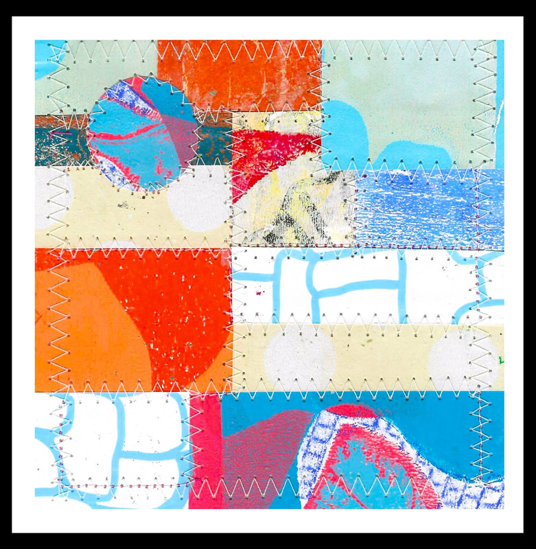 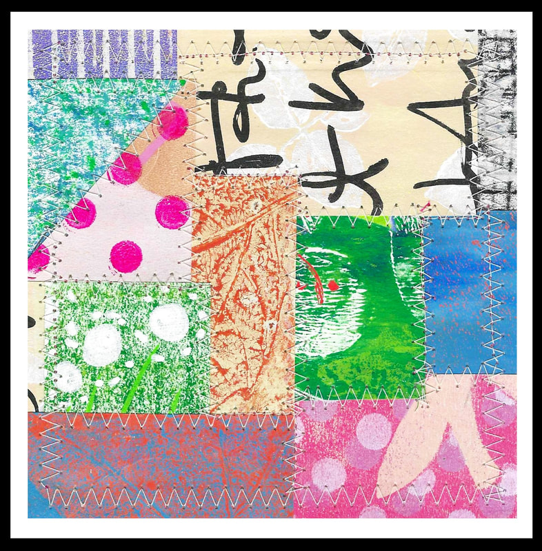 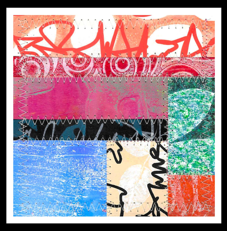 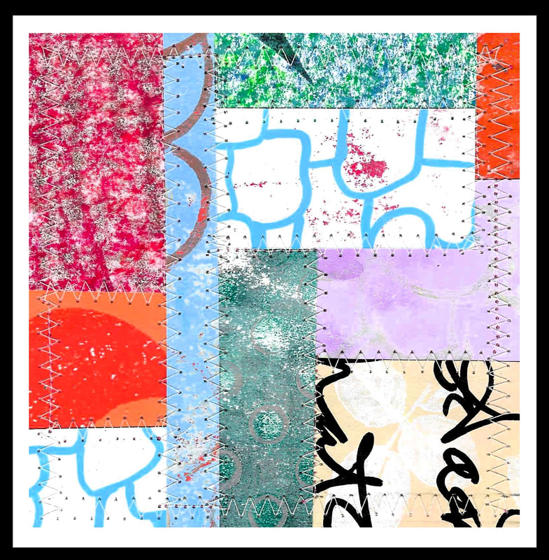 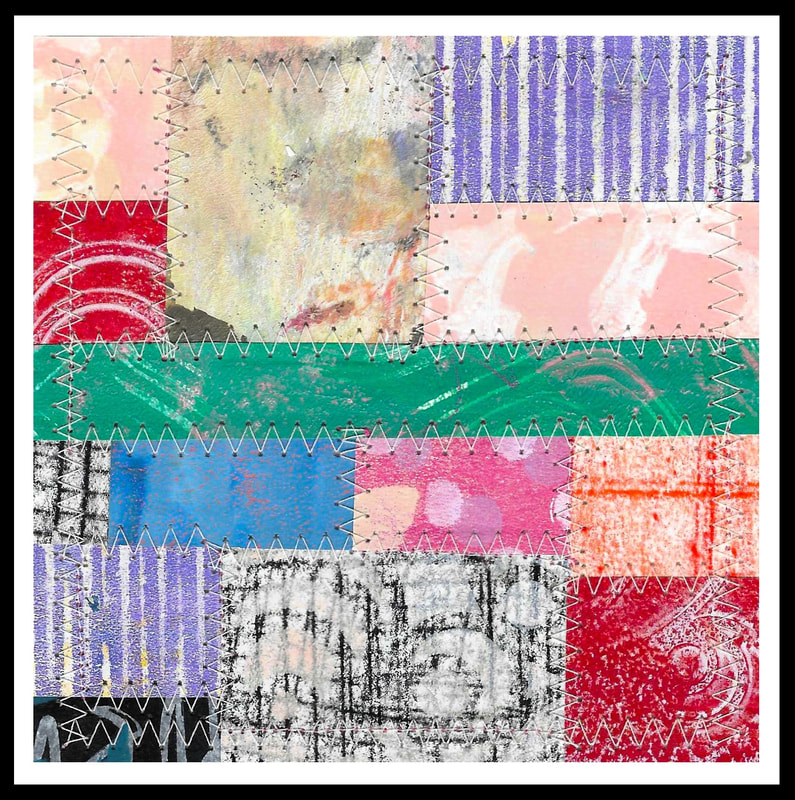 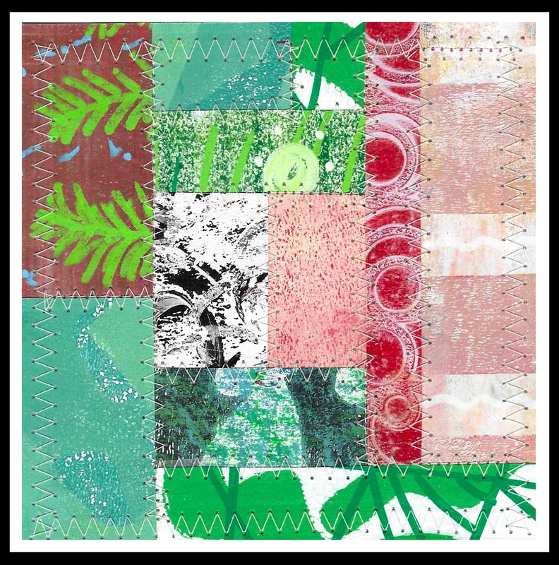 5" x 5" paper collages for upcoming handmade collage book 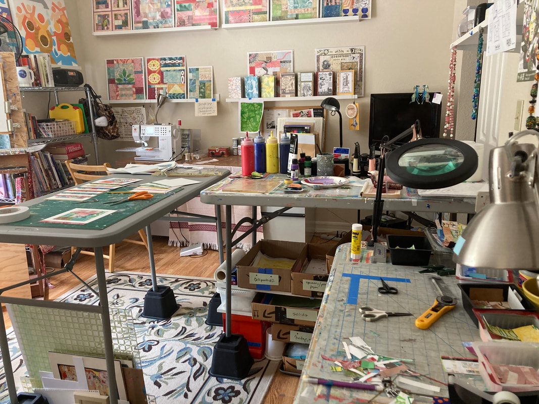 Studio view, new configuration (honestly, I thought it looked better!) I thought that showing a view of my new table configuration might be interesting. Maybe not, Who knows? This last weekend it was raining and I was thinking about how to get more organized. Prior to this new table grouping, I had to do my "wet" processes and "dry" processes at one table. It isn't a big deal but I always thought that I would get paint on something important. These tables are readily available and very inexpensive. I also picked up some table risers at Amazon to raise the height of the tables so that I can work standing up without killing my back. I may add one more lamp for task lighting. (Seeing well as I have gotten older has become harder.) Anyway, it looks kind of sloppy I guess, maybe crowded more likely. It works very well though and that makes me happy. When you get up in the morning and come into your favorite spot it ought to be as you like it.
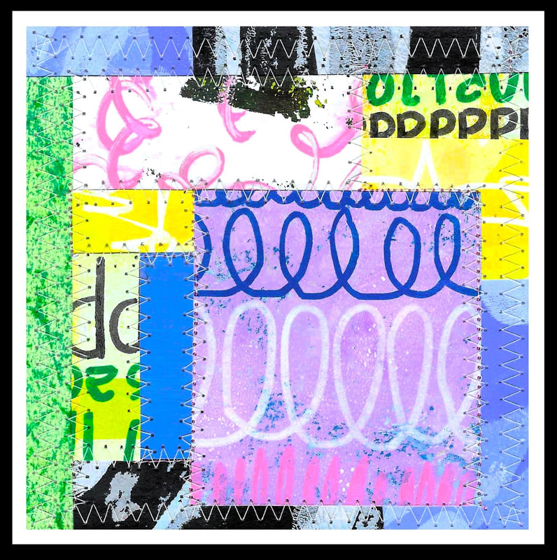
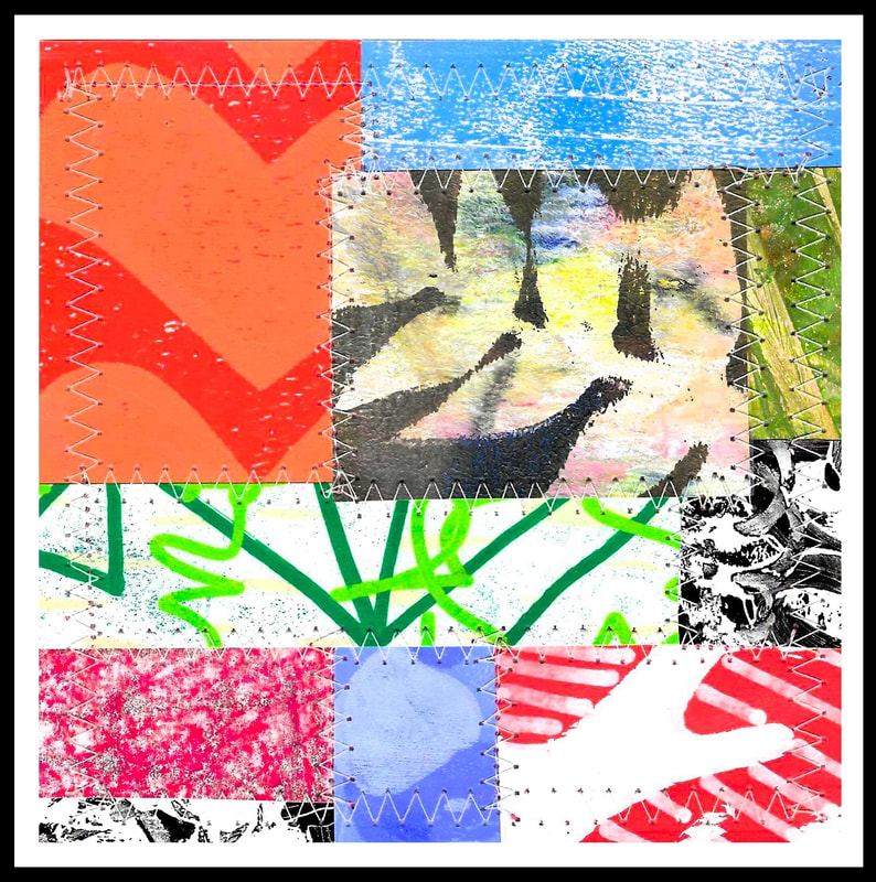
I have new work to show (see above). These are small collages that are going to be part of a larger collage book that I am doing. This will be my fourth book. The books are hand bound using the coptic stitch. This stitching is quite the learning curve! Originally the books were a way to use up all of the papers that I have printed (and continue to print) but now I just really like doing them. It has been really important to me lately to put as much of my own tastes and ideas into my art as possible, including these books. I am notorious for seeing someone else's work and thinking that they know better than me; that I need to do what they are doing in order to make better art. In reality, their art is likely better but how does that help me? I sort of see it as wishing that I had someone else's fingerprints, you know? At this point though, I know something too and now is the time for it. I feel like I can see what it is that I like about that person's work and use that idea as a springboard for something very Libby-like. The papers are all printed on a gelli plate using acrylic paints. The writing and marks are done with an acrylic paint pen or artist grade crayons. These pens are AWESOME! I tried them once before and couldn't deal with them. These Posca pens are really nice though and work well. I am continuing to use the sewing machine to zig zag stitch. It really tamps the various papers down and makes things look neat and clean. I like that plus there is the association with traditional quilting and sewing but in a new kind of way with paper. I like that too. I am trying to think of a way to show the books that I am making. A video? Pictures? I don't know. My skill set isn't quite there for the video but I guess I can see about it. Still images are more likely. If there are comments please email me: [email protected] Thanks, Libby 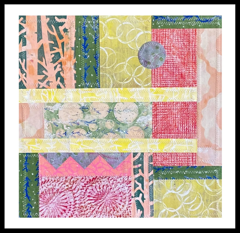 Adaptations 1 15" x 15" collage on matboard sewing, hand printed and painted papers 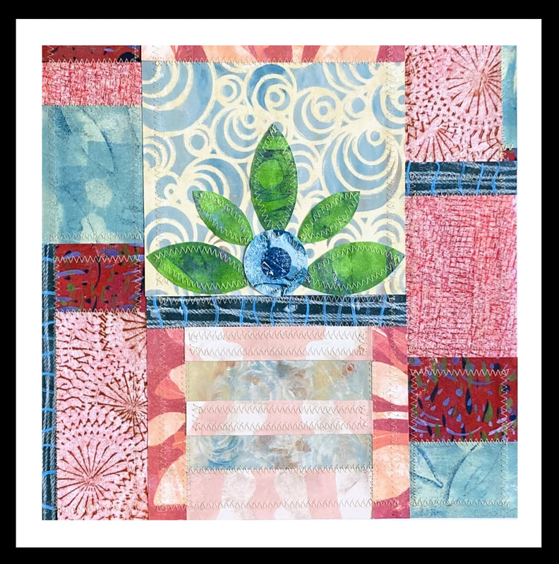 What Remains 15" x 15" paper collage on board thread, paint, printing, frottage I have been working away on collages based on the grid (what I think of as "geometric" in nature). To me, they are reminiscent of traditional quilts with their orderliness, separate blocks and geometric shapes. They aren't perfect though, not lined up with straight lines, and I am trying to decide of this is something that will bother me or if I can just make it part of the piece. I think it fits with the idea of everyday life not being perfect, it's a metaphor for that, but still. I don't think things like this should hinge on perfection though. It's really not the point for me when being creative. For now though, this is how it is going to be.
What is exciting for me though is the sewing. If the viewer zooms in on the photo they can see that I have taken to sewing the borders of the paper blocks. This is very new for me. The blocks themselves are not sewn together to make one big block. The edges are simply stitched. I should say that for the most part the blocks are individual. There are some though that are taped together on the back. This is new for me too. And the biggest new thing is how I am now adhering the blocks to the board via double sided tape. Previously I had been using rice based glue which I really love. But when gluing multiple pieces of layered paper together it doesn't really work well. (It gets very lumpy.) This is all technical type stuff (who cares right?) but it is part of what allows me to make something that I want. You really do have to learn what your materials do and how to work them. The last thing is that I have started a project. I made myself a sketchbook using my painted papers and two boards covered with my papers. I used some special stitching (coptic stitching) to pull everything together. There are about 40 blank pages inside to fill. I have been taking the remnants of my papers and doing small 4" x 6" collages. I am trying to test out different ideas like color combinations, varied print scales, varied pattern scales and embroidery and stitching. I do one nearly every day which is great. They are quick and fun and I don't have too many rules other than to try something new. I am extremely pleased so far. The first collage shown above is an "adaptation" of one of the practice collages in my sketchbook. The title is called "Adaptations" because the piece is really just one interpretation of the original collage. I had to adjust or adapt my thinking to not copy the original collage completely. Something in a small format doesn't always work good in a larger format. The title also reminded me of course with how in nature, in real life, creatures adapt and evolve every day as well as over long periods of time. Humans included! In any case, I will need to decide how to share the book when I am done. Stay tuned! Thanks for reading and email a comment if you would like to. Libby [email protected] 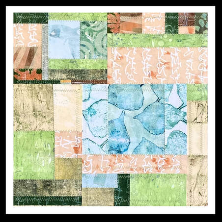 River Walk 1 16" x 16" collage on board As 2023 came to a close, I found myself wanting to switch the way that I make art. During 2023, I had explored the use of found images and different papers: free web based photographs, vintage family photos, and some specialty papers purchased online. Many of the collages had to do with my interior life and how I expressed those feelings and ideas with different materials. Truthfully though, my art making became very dependent on finding photos, scanning and editing them, and then printing them. As much as I loved the photos and the resulting work, I was sick of being on the computer! What a grind. And to make things worse, my computer crashed and some of my source photos were lost. It was then that I realized that I was perhaps working in the wrong direction and with the wrong tools for my temperament.
So, I slowly began to pivot. I thought of ways to make art that didn't involve the computer so much. I unearthed my printing plate (gelli plate) from the closet and started to mess around with it. I also broke out my artist grade crayons, my colored pencils and my sewing machine. Going low tech never felt so good! To begin things, I chose to work on two themes that have been reoccurring in my work for awhile now: nature and nurture. I have worked on both ideas separately. What would happen if I tried to combine them in a more purposeful way? With the images I print and the colors that I select, I am trying to focus on what I see around me on my walks and sporadic hikes. At the same time, I have quilts on my mind: The patterns, the colors, and their history: Quilts are the ultimate in nurturing. They keep us warm and are given to us in love and friendship. Maybe I am drawing a tenuous attachment here but I see nature as nurturing and the quilts as nurturing in the same sort of way. Quilts too are very reassuring with their grid like construction and block repetition. There is an orderliness there that is similar to what you find in nature. For the first time too I am stitching the pieces together with my sewing machine. I see this as an active and tangible way to fuse the two ideas of nature and nurture together. One thing is sure. As the year progresses I will continue to put these two ideas together. For now I am actively fleshing them out, as they say. Nature and nurture are part of my experience in the world. They are both pieces of the puzzle that I try to solve every day. It's my hope that as I work, the materials and format will tell me what I need to know. Thanks, Libby [email protected] For reasons that make sense to me, I have moved the explanation about this year's work to the blog section. Can we ever get away from ourselves? I have wondered about this over the years; are our true natures inevitable and unescapable? It has occurred to me that human beings have an inviolable core. I think all of our efforts are meant to help bring us back to this immutable center. We just naturally strive for equilibrium and search for familiarity. I think it is this core that shows up as the "nature" part of ourselves. And it is the flexibility in either direction due to influence, environment, and upbringing that represents the "nurture" part of the equation. These ideas are at the root of my thinking and are present in my work this year as I begin again.
For my current work, I have been drawn back to the grid and the idea of quilting. Quilting was where I started with art making. There is a lot of order in quilt making. Blocks get lined up and points are sharp. It's very orderly and it is something that I find comforting. As a challenge to myself, I decided to combine the concept of quilt making with collage work and printmaking. Normally I paint my own collage papers but I wanted to try printing them instead on a gelli plate. Turns out this printing method can be very random. It's hard for me to control the outcome of these prints. I often feel that the best prints are complete surprises. This diversity in the printing results made me think about the differences (and similarities) among people and brought me back to my original question: can we ever escape ourselves?. I don't know the answer but it's what I am going to think about this year as I make my work. I want to represent my thoughts and feelings about nature and nurture and the reciprocal and interconnected relationship between the two. I also want to play with the multiple meanings of those two words. To do this, I will use colors, textures, and lines that might evoke natural elements. At the same time, the grid like format will be familiar in its orderly layout. A push and pull between nature, order and randomness. I hope the viewer will notice squares, rectangles and triangles evoking quilt like patterns while also noticing soothing colors, images, and patterns that evoke ideas of the natural world. For the first time, I am using my sewing machine to stitch the different pieces of paper together. I feel this is a kind of way to represent the fusion of these two themes in a tangible way. As with all of my work, I hope that the elements I use will suggest a kind of narrative to the viewer, something I haven't thought about but that will be personal for them. 42124: I am continuing to work on this subject and have moved the original post here to make room for more artwork on the 2024 page. 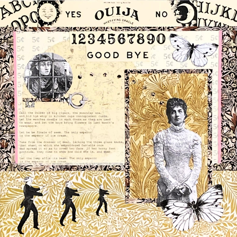 Do No Harm 16" x 16" collage on board It's been a few minutes, as they say, since I have written a post talking about my work. I stopped writing because it seemed futile since really no one seemed to be reading and commenting. Isn't that one of the purposes of blogging? People read your thoughts and then write in to tell you something about those thoughts, good or bad. Even without that back and forth, I know that the writing is part of the art making for me, somehow, and I should really keep that up in order to help stay connected to the work. Even if no one reads that writing I am still reading it myself.
Inspiration: For this latest piece, I drew on my recent experience with reading two separate works. The first work is by Charlotte Perkins Gilman. It's called The Yellow Wallpaper and it chronicles the rather quick descent into madness of a young and well-to-do wife and new mother, possibly called Jane. The second work is a play by Henrik Ibsen called A Doll's House. The play tells the story of Nora and her husband and Nora's rather rude awakening to the reality of her marriage and relationship. I read the works back to back and they became entwined in my mind. Both characters are women living in a time when women's rights weren't terribly robust. Choices weren't abundant and men tended to be in control. When both women could really use some help, their husbands make bad decisions which end up having negative consequences for the women. Of the two, the character of Nora in the Ibsen play does better. She at least is able to leave the marriage but even so, at what cost? The other, Jane, cannot physically leave. Because she is confined by her husband to bedrest and cannot thrive, she has a nervous breakdown. She mentally checks out, in a sense. My Analysis: Not exactly cheerful subject matter I know but still. It made me think. I also remembered (and this brought it all together for me) a Wallace Stevens poem called The Emperor of Ice Cream. One of the final sentences of the poem is "Let the lamp affix its beam..." I just love this. Using a modern term, that is a call to bring it on! Do your worst! Shine a light on everything, the line seems to say, and I will still surpass the trouble and embarrassment of whatever you choose to uncover. The truth cannot hurt me. There is just a finality about things I guess. That may not be how Stevens exactly meant it but it's how I imagined it. And, circling back to the two works I read, I think those ideas apply to both women. Both women escape their situation in a fashion but at what cost? Ultimately, they can't escape their fate. Symbolism: I know that it's impossible to take all of what I read and what I thought about the two works and the poem and reflect that back in my collage. I can't possibly represent those ideas (I don't have the skills for that). But, I chose images that I thought would be supportive (which is different than strict representation). The woman in the dress to the right is the main character, sort of rolling her eyes heavenward in a "now what?" kind of way. I feel that she looks polite and is possibly the master of forbearance. The Ouija board image reflects back to The Yellow Wall Paper story. Jane's husband doesn't believe in the supernatural (Jane does). It's one more way that he dismisses her. (Nora is dismissed by her husband in numerous ways as well, through his use of a pet name for her as well as telling her how simple and child like she is.) Jane also locks herself in her room and tosses the key into the garden (hence the key imagery). Moreover, both women eventually arrive at the "key" or solution to their particular dilemmas. Both women are in a "cage" of sorts so I included that imagery as well. There is the image of the three blindfolded men (self explanatory I think. Just because a man tells you what to do doesn't mean that is the correct thing. Even men can't know everything.) I chose the butterflies because I see them as a symbol of transformation and freedom. I also took some effort to select a good printed background. The flowered designs are from a William Morris book of papers. I thought that would be appropriate for the time period of both works. Plus, Morris's patterns are so detailed and intense- a person could get bogged down or lost, mentally, by them. The colors are a kind of yellowish gold. And lastly, there is the structure of the piece itself. I meant the whole image to look like Lucy at her help booth in a Charlie Brown episode. The top and sides of the piece (dark flowered paper) are the top and sides of the booth while the bottom of the booth is the lighter colored gold paper. Lucy always charges 5 cents a session for psychiatric help so I used the number 5 and the cents symbol in the background paper. What Else?: I originally intended that this piece be a commentary of my views on the availability of mental health help and medical help in general (hence the title of the piece). I know from news stories that the need for healthcare has skyrocketed. Doctors, nurses and other medical professionals are in dire need here in the US. It's much worse in other countries. I also know that many people simply don't have health care or what they have is inadequate. My own experience in the medical system has been very mixed. For a few life threatening things, I got the care I needed to save my life. For the other more mundane and chronic problems, help has been very poor. I should say that getting my problems resolved (which they haven't been) and being churned up by the system in the process has taken a real toll on my mental health. One result is that my view of medical care has changed completely particularly as it relates to the management of chronic medical conditions. Not only is our system set up poorly to handle chronic ailments but the cures are often worse than the ailment itself. I can't tell you the number of times the side effects were more objectionable than the original problem. It's clear to me now why the supplement business is so lucrative. In any case, these were my initial thoughts as I started the piece. Things morphed, obviously, as I read a few books and a poem. I think that is how my art works though. It's very in-the-moment and reflects what I am currently thinking but it also takes in my past experiences and ideas. . It isn't a straight forward linear thing. It's very circular and almost like an Apollonian circle, with many ideas intersecting around a central point. I am very pleased with the results of this piece. I know however that not everyone will see things my way. Interpretations will be varied and maybe not what I had intended. That's just fine with me. I have medication and meditation for that! Thanks to anyone who has read the post. Send me an email if you like. Libby [email protected]  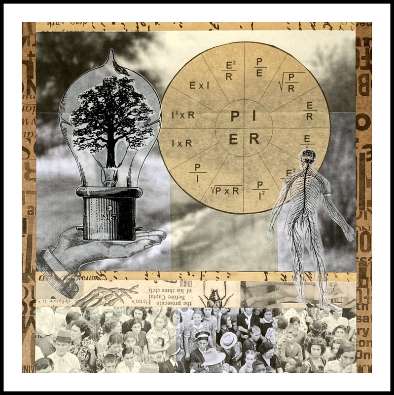 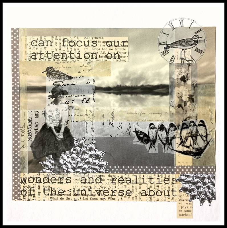 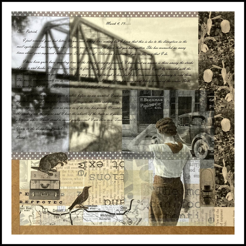 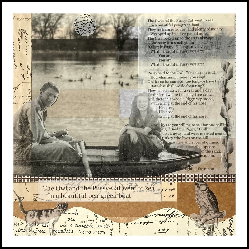 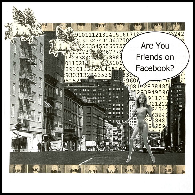 The above images should be clickable for a better look. They are about 10" x 10", photos, text, and transparent deli wrap! For a long time now, on and off, I have wanted to use my own photos in my artwork. I just couldn't see how to do it. I have tried using them for reference material when developing shapes for my abstract collages and of course I used them very literally when I was painting landscapes. These ways were pretty unsatisfactory, however. So, I put the idea aside.
I suppose that the right moment and idea must present themselves and that one has to wait patiently for that to happen. I have seen work over the years that seems to use actual photos with other ephemera rather successfully. Taking those ideas as the basis for your own interpretations could be a gateway in to doing something different. So, that is what I did. I started with the Barbie piece shown in the lower right corner. That is my own photo of my own Barbie doll. Those photos shown on the borders are from my high school yearbook. I like the piece a lot though poor Barbie seems to not have an outfit, as improbable as that may seem. From this piece, sprang the others. My idea was to use images of people, of places, and of things. I wanted some blurred backgrounds and some crisp closeups to play with perspective. I wanted to layer some transparent printed papers (the deli wrap) to enhance colors and to present layering. I also wanted to bring together nature, (both people and other creatures), science and the numinous (spiritual). For the piece in the lower left corner, I wrote my own love letter from the woman to the man that I imagined she was waiting for. The bottom middle piece is another love story founded on a poem in the public domain. The top middle piece is about the book called The Electricity of All Living Things, by Katherine May. And the piece in the far left upper corner, called Rachel, is about Rachel Carson, the late writer, naturalist and biologist. Except for the Barbie piece, all of the backgrounds shown are my own photos. The flower images (vertical borders) are mine as well. The people and animals are all images from my own books or from online (from the public domain). I used just three colors of copy paper and some brown "cardstock". I also used the white semi transparent deli paper (both undyed and tea stained) as well as a brown coffee filter that I printed the electrical equation on. I used colored pencils to enhance some of the black and white images. This is about as "mixed media" as I get. I am very pleased with myself for having tried something new. I am a real stick in the mud about things so this was a big leap. I like the ideas and effects. I would also add that I abandoned all remaining notions of using "neutral" colors. What a bunch of nonsense that is. I really want to emphasize this. All color, even white and black, has something to it: under color (red, yellow, or blue), contrast (dark or light), temperature, and chroma (how saturated the color is). And these are all relative things meaning that once you start to mix and match, things can change. Neutral indeed! Lastly, I really want to recommend a book that I am reading. It's called Always, Rachel: The Letters of Rachel Carson and Dorothy Freeman edited by Martha Freeman. It's been a rather profound awakening for me. That two people could love each other so deeply AND be able to express that love fully in person and via letters is a real miracle. It's extra incredible because they are women (one of whom was married). And it's the 50's. And did I mention those letters? Wow. At times, it feels very voyeuristic, as if you are reading something incredibly private though the letters are simply intimate in a non sexual way. And at first it was difficult for me, a heterosexual woman, to understand. Were these ladies lesbians? What category did they fall into? I thought of myself too as very accepting of many types of relationships so what was my question exactly? It didn't take long to adjust my thinking, however. There is no category except that which describes two human beings that love each other deeply and express that love over and over again. The details don't matter, just the love. I am new to reading epistolary writing so it's an adjustment to read someone else's thoughts. As I said, it feels like an intrusion. But so far, the reading has been a wonderful lesson for me. It's never too late to expand your thinking. And how dare anyone rush to judgement concerning another human being. How ungenerous and unkind we can be. Now, go read that book and be transformed! Alright, as always, email if you have thoughts. Libby [email protected]  Cisco Bound |
Archives
July 2024
|