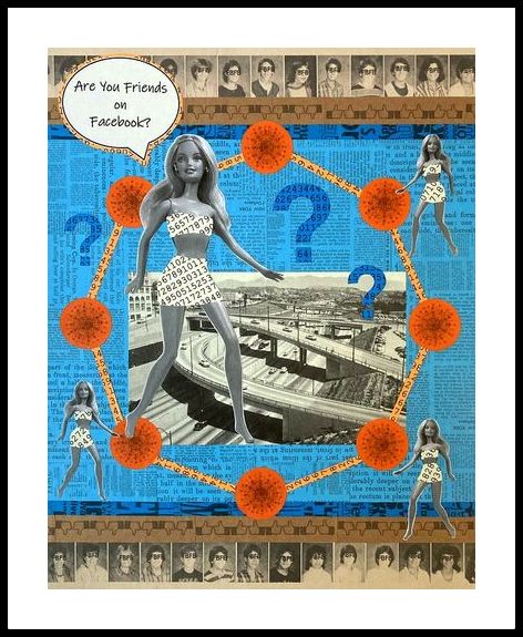
 Are You Friends on Facebook? 20" x 16" analog collage on matboard The above piece started as a small paper sketch in my sketchbook. I have seen a lot of collages that use the idea of scale as a starting point. You know, the ones that show a really large baby and a tiny mountain or a huge cougar and some small people looking on. My sketch involved a tall woman leaping and a much smaller series of skyscrapers. It reminded me of that B movie, The Attack of The 50 ft Woman. I thought the movie reference would be a good start for an idea.
I started to enlarge my sketch and I quickly ran into trouble. It happens often that something that looks good small just doesn't work on a larger scale. I had to rethink my idea. At the same time, the movie reference reminded me of something that I had read a while back. NY Times columnist David Brooks wrote a piece on mass shooters and what might be motivating their actions. He talked a lot about loneliness and isolation and a lack of good social/medical/mental health infrastructure. The emphasis was really on social isolation and how a person could be seemingly well connected, socially, and still be lonely. He cited the case of Yvette Vickers. She was an actress who played a part in the above mentioned movie, Attack of the 50ft Woman. She passed away in her home and her death went undiscovered for nearly a year. At the time of her passing, she had a crazy amount of followers on Facebook, some number in the thousands. Despite that, no one seemed to notice that she wasn't around posting and to try to actively find out why. My remembering David Brooks' column got me thinking about a question I have been asked repeatedly: am I friends with so-and-so (fill in the blank) on Facebook? The query has always irked me because invariably, the person in question, the one I might possibly know, is someone I have never met or spoken to and could not pick out of a police lineup. I always feel like the person I am talking with (presumably a friend who knows me) would know already that I don't know someone. It strikes me as a not-so-well-thought-out question. I would rather be asked if I know someone, period. I hate that FB is in the mix as a qualifier. That question, to me, sounds more straight forward and reasonable. You either know someone or you don't or you have heard of them but have never met them. I think semantics are pretty important. And I hate mindless assumptions. I feel like we have gotten sloppy in our communication somehow. This isn't to say that I don't have friends on FB that I have never met. I do. They are people that I have interacted with over the years exclusively online. (They are also relatives, and neighborhood friends, and friends of longstanding from high school onward. Maybe people that I don't see terribly often but friends nonetheless.) I feel though that if I went missing, someone online might notice (I hope). And I feel that if I traveled to another state and let one of my online friends know I would be in the area, that an invitation to get together would be easy to obtain. And I would feel safe in doing so. I really dislike FB and what I think they have done to the ways that we communicate. In any case, I digress. So, to wrap it up, I brought together several ideas for the collage: the idea of the movie, Yvette Vicker's death, and the inane phrase/question which became the title of the piece. I needed a spokesmodel, so to speak, and I didn't really have a good female image on hand. That's how Barbie became my model. She is actually my own personal Barbie bought quite a few years ago. And she is, after all, long legged, beautiful, and just a little wacko in concept. Seemed like she would fit the bill. The images of the people are from my own junior high school yearbook. I created all of the papers myself using images I already had. The orange circles are actually from my Ernst Haeckel book. The image is a phaeodaria, a type of unicellular plankton made in part of silica (a kind of glass). If you zoom in it looks a little web like in design which for me represented the web of contacts on FB. I made a kind of circle connecting those plankton images. The only image that isn't mine is the one of the freeway. It's of Los Angeles in the 60's and I lifted it from E Bay. I chose the color blue because it's an FB color and I made the numbers paper to highlight the concept of the number of friends that people have on FB. I am really pleased with the outcome. It nearly didn't get off the ground and almost fell apart a few times. It takes a lot of energy sometimes to just sit with an idea and roll it around in my mind to search for a solution. Many days pass... Eventually I can solve the puzzle. With any luck, I will like the results for a long time to come. I know there may be people reading or who see the image and won't understand or will be perturbed or offended or will feel bad about the number of FB friends that they have and will think I am making fun of them or calling their judgment into question somehow. I am not. I am not maligning Barbie either or making any direct commentary about her intelligence, the intelligence of people who use FB or who ask questions or any other connections or interpretations. Draw your own conclusions here. View FB and your time on Earth however you want. And it isn't lost on me that I will post this piece on FB shortly. I get it. Use social media carefully, choose your words wisely, and make discerning distinctions. Thanks for reading. Libby [email protected] 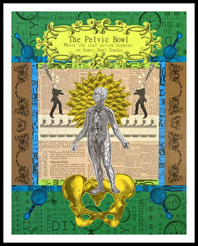 De Novo Natus Est (Born Anew) 16" x 20" collage on matboard (analog) This piece is my last one for 2022 and I think it is rather fitting in a way. I have spent the entirety of 2022 dealing with structures and organs housed in my pelvis. That experience has influenced my work this year and this piece in particular. So, a few things.
It often happens that I get inspiration for a collage while I am doing something that is not art related. I find that during this time, connections get made. As an example, I was getting ready for my day and once again thinking about the difficulty I was having with my body. The trouble all seemed to be centered in my pelvic region. Or is it my mind that is at issue? Or my central nervous system? I didn't know anymore. I thought about how the end of the year was coming up. I had just bought a DVD to help with relaxing and strengthening the pelvic floor. I had also made a few small collages with images of women arising out of some structure, like Botticelli's Venus. And then it seemed like all of a sudden this image with a pelvis just popped into my head. I laughed, thinking that, "Screw the Super Bowl, we ought to have the Pelvic Bowl". Women would applaud. "Finally", they would say, "some recognition". I quickly wrote down everything that I had imagined and put the paper aside. My collage book was in process and I had some other things to do. Finally, when the collage book was finished, I began to work on this Venus/Pelvis idea. I liked the idea of a battle, (which is what the Super Bowl is billed as), only it's a battle between a person (in this case a woman), and the disfunction that can arise in the pelvic region. I also wanted to represent my time dealing with the traditional medical establishment which had been a battle of another sort. I saw the images of referees, (for me, they represent doctors or insurance companies), arguing over the woman and her need for medical care. To be clear, I am not centered on reproductive rights here though that is a possible interpretation. I am focused on my own issues. Really, this is what I like about doing collages. There are lots of ways to see the finished piece that all depend on the person's perspective. I am really pleased with how the piece turned out. I made the collage of words printed on the green paper. I chose words and phrases that represented my own frustrations. If you look closely at the brown paper, the images are actually football players and a pelvis. From a distance, it looks like flourish-y scroll work. The design behind the woman is from Ernst Haeckel and his book, Art Forms of Nature. It's a bryozoa, a type of simple aquatic invertebrate. I very much like that we are descended (and share company with) from such simple creatures. All life forms are part of our heritage as human beings. The colors are important too. Green, for me, means life. Blue reminds me of water and clarity and calmness. And yellow is an energetic kind of hue. It's the color of our own sun, something that helps to generate life. Yellow, blue and green collectively also represent, for me, our hydrological cycle: rain, rivers, and the recycling of water through the atmosphere. And of course, there is the woman. In my mind, she is rising from her problems, transcending the nonsense that is the current day medical grinder, and being born anew, free of trouble and turmoil, steeped in comfort and good health. A happy ending, no? I think it's possible to really have some difficulty with art making and trying to convey a specific message or feeling. The artist wants the piece to be meaningful; to encapsulate all that they are feeling and want to say. And the artist wants the viewer to see this, to know that the work is important. That's a tall order, for me anyway. All that I can hope to do in this lifetime I think, is make something solid; something reasonably well executed and good to look at. The rest of it, whether or not I hit the mark with the message, is all mine. I can look at the work endlessly and access my own feelings about things. But I hope that the viewer sees something too. I can't rely on that, however, as a source of satisfaction. I can only look inward to see if the work makes me happy or not, if it somehow helps me cope or feel better about life. This piece that I made is serving its initial purpose. It is helping me to deal with the fucked-up-ness of our medical system: the appointments that are never in enough time; humiliating tests and exams; medicine that makes you ill with side effects; the non-answer, answer; and doctors who are well meaning but just don't have enough time to deal with everyone and everything put in front of them. The system is fucked, that's all I can say. It's better than in other countries to be sure, and it has helped me when I needed it most (cancer and a heart attack) but it is a maddening structure at best. I have met some wonderful people over the years, nurses in particular. But they too are constrained and frustrated by the system. And the worst part has to be that you are sick. You don't feel well and are not up to dealing with being on hold, getting a non-answer, and feeling as if no one is listening and that the situation is hopeless. I don't know. I could go on but... Lastly, the title for this piece might have been any number of things. I finally chose the Latin phrase De novo natus est which means "Born anew". My experience with feeling unwell for a protracted period of time (i.e. dealing with chronic illness) is that your prayers frequently center around asking for a second chance. "Please", you think, "just let me start over and I will do everything right this time, I swear". There is the very real sense that you have done something to bring the trouble upon yourself. If only you had eaten right, not taken that medicine or maybe even had different genes. Who knows? I know that for myself, a second chance would feel like being re born; born anew with the promise that this time around things will be different. Hope springs eternal, right? (As I said, an artist can ask a lot of their work.) It's a long post, I know. It's been a long year. I hope for anyone that made it to the end that the post brought something to your own personal table, as it were. Feel free to let me know and thank you for reading. Libby PS: I am not being cagey by not mentioning my medical situation. I have IBS , anxiety, and am recovering from a host of GI/pelvic issues. Menopause hasn't exactly helped the situation. Otherwise, things are just fine.  Perspective 16" x 20" Collage on board found images and personal photos I feel like the above piece has many "origin threads", for lack of a better term. Detailing how the collage took shape may make things easier to understand so here goes.
On one of my walks during July, I started to notice all of these little holes in the ground. They were covered with spider webs and had a very distinct "funnel like" opening. As I was looking at one, I saw a small spider peer out at me through the opening. I looked this up and I think what I was seeing was a type of "funnel" web spider. As you might expect, the spider builds this web around a hole and the unsuspecting insect gets trapped. The spider pops out to secure his prey. I took several photos of these holes and knew that I wanted to use them. They are such a clear example of one creature preying upon another. One question I had about this funnel web setup was whether or not a non human creature could be hopeful. Was that spider in the hole hoping, in his own way, to catch something? How could that expectation be measured? Does our inability to really gauge that hopefulness prevent us from appreciating that spider, and by extension, other forms of life? Do we ultimately see other creatures as ours to possess and manipulate because we don't understand them or have empathy? These are deep but necessary questions. The next thing that happened was Liz Cheney's loss in her bid for re election to the house of representatives. I am not even a Republican but I felt this loss keenly. Have we turned into a nation of liars? People who lie and it's just fine? It seems incredibly un American to me. Fundamentally un American. This is where the spider/web quote came from. Lies beget more lies. It's a way of being that does indeed become tangled. Incidentally, that isn't a Shakespeare quote. It's a Sir Walter Scott quote. I looked it up! I also wanted to give a sense of the importance of time and the life cycle. The little girl is young, set against a clock that shows no specific time. She is surrounded by flowers and tarweeds. (Tarweeds are common to my area and very interesting. They exude a resin which traps insects that would otherwise prey on the plant. The plant has evolutionarily developed this resin which then attracts other insects that eat the dead and dying insects that have been trapped. The plant developed a defense mechanism against predation.) The vultures await in the background on a dead tree. Vultures are scavengers and great cleaner-uppers. There are three crows who might signify death to some but maybe even joy and celebration to others. And lastly, Rosh Ha Shanah is Sunday. It's a time of rebirth and renewal, repentance and reflection. It's a time to make and to be made whole again. It's the biggest time in the Jewish calendar; the most significant. Your fate hangs in the balance, literally. God is judging so you better get it together quick! I made a little envelope depicting the words to the sacred poetry that is written for this holiday. I called the piece Perspective for several reasons. Who is the prey and who is being preyed upon? Death and life are all around us and at any moment you may be on one side of the coin or the other. Beauty and terror side by side. Youth and innocence right alongside age old symbols. And, lying where once there was truth. Everything depends on perspective I guess. Lastly, my biggest coup this time was the image of the girl. She is integrated with my own photos of the tarweeds and the spider hole. I thought the blending of those three items went very well. My time as a quilter where I learned about applique came in handy. I "fussy cut" the tarweed flowers and the leaves from the photo of the girl. I scattered them around to hide the transition from the girl image to the spider hole image. That transition contained a very hard line which I thought abrupt. The leaves from the girl photo and tarweed flowers served to soften that line. Happy New Year to everyone. (An early thought): May you all have a "good sealing" as you ponder your transgressions and how to atone. May we all be inscribed in the highest of books on the right side of that particular ledger. Shana Tovah (good year) and my new favorite, tizkee vetihyee ve’orekh yamim (may you merit life-long life!) Libby [email protected] https://follow.it/libby-fife-fine-art-blog?pub PS-I followed the good example of my friend Randall and have started using the feed reader "Followit". You can now simply choose to follow these posts via email. You can find one of two buttons that are placed on the home page of my site or on the blog post page upper right corner. Let me knw how you do. 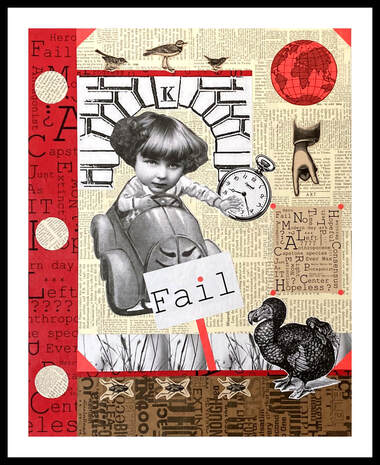 Carry On (Business as Usual) 16" x 20" collage found images, personal photos This piece started as a collage in my sketchbook and came from an idea that I had seen in my mind's eye. As is often the case, what I saw in my mind was better than the subsequent sketch! That's OK though. That is what a sketchbook is for right? To try something our before it hits prime time.
I went on to some other ideas, more sketches that worked out, and I refined my idea. I made a couple of journals, a new idea for me, and I did a few more paper sketches. Finally, I got my act together and got my idea solidified. The piece reflects my mindset about global warming and in general, our collective attitude towards our environment and our future. At first, the little girl with that expression on her face, had me stymied. Was she the protagonist or the antagonist? I think she is both. We want to have our cake and to eat it too. The end will come but in the meantime I have got to get to the grocery store. Let me hop in my car, use up some gas (sorry Mr. Dinosaur), and buy something! I am not negating or ignorant of the things that are being done everyday to help our situation. Real people are working diligently to answer big questions. But, it's grim. In my neck of the woods, we will be having a week of record temperatures. I am talking 112, 116, 108 degrees. In September. We are going down and that is that. And I didn't know there was a name for the worry that I have. It's called eco anxiety. Did you know that? I didn't. In any case, the piece references the poor Dodo, long gone now, the red hot world to come and the cockroach which may be one of the survivors. There is of course our red hot planet as well as a nod to Bob Dylan and his series of signs (Subterranean Homesick Blues). I also included an image of the letter "K" for keystone species, my own image of "weeds" and of course that crazy girl in the car shoving time out of the way, somehow. That head on the girl is from some other source but the car itself and the body in it is from a Dick and Jane book. That girl is little Sally shoving a couple of dogs out of her way (in the story). Big baby that Sally is, I thought she represented much of the population in her impatience. (I am not perfect OK? I am sitting here in my air conditioned home using propane and doing God knows what all else to bring about the end.) It's not all bad news, though I am re reading Silent Spring. Not really good news but alright. I have discovered what are called "junk journals" though I really dislike that term. I have made three books of my own, one of which reflects the collages that I do. My thought is that the book and my collages go together, one informing the other. I am finishing one up right now that reflects the same sort of theme as the above piece and uses many of the same images. The books are fun to do and help to use up some of the printed images that I have on hand. They are very methodical which appeals to me. It's really a step by step process and very satisfying to have several complete pages at the end of the day. Alright, that's it for now. I hope anyone reading is doing alright. The whole country looks like it is suffering through the heat. Sigh... Thanks for reading, Libby [email protected] 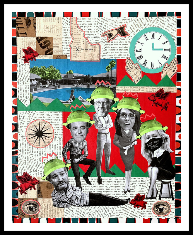 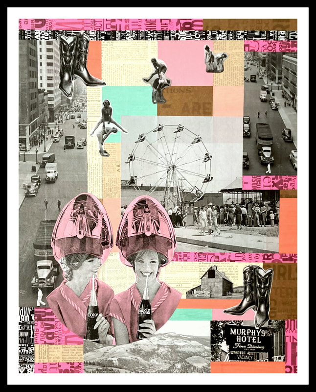 Fraught With Danger 16" x 20" collage/mixed media Town and Country 16" x 20" collage/mixed media I completed two collages in the month of June, as seen above. I am pleased with both of them for several reasons.
First, I have successfully begun to use colored copy paper in my collages. It's a big deal for me because I have always used my own painted papers. I like having control via painting. It's possible to get just the "right" color. We recently bought a different printer however and the printer ink does not adhere to the painted paper. Colored copy paper is an economical choice/solution and provides new and exciting possibilities. I feel the look of the brightly colored paper can be tempered with the more neutral browns and beiges. I am still learning how to use the paper in a way that will be visually pleasing. The second reason that I am pleased with the pieces has to do with the use of photographs. It's a real challenge to put images together and to figure out how to use them. Just finding them is a chore sometimes. I am learning that it is better in some ways to have a collection of images and see which ones can go together and tell a story. Hunting for images to support a specific idea is much more difficult and requires a lot of mental flexibility. Both ways work but I want to get better at the process. The final thing I am pleased with is the quilting references that I have begun to use. For the first piece, I wanted to reference a kind of "9 patch" quilt idea. The second piece references simple blocks. I did this in two of the pieces from last month as well. I like the idea of putting down a background first and then adding and integrating images and text. I really want the background though to blend with the figures and text to create one dynamic piece. That's my goal anyway. So. The content of both pieces. Let's start with the hardest one (the first one on the left). Whenever I do a political piece, it's a gamble. People are not likely to get what I want to say, which is fine of course. Or people may be offended. That's OK too. I just have some mixed feelings about "statement" pieces. In any case, let me explain what I had in mind. The piece references the B-52's Private Idaho song. Not everyone will remember this song, I realize that. I never fully knew the lyrics myself or what the song was about but the whole thing seems very apt to describe the current political climate of paranoia and wild, unfounded lies and accusations. I am referring to the extreme Right Wing section of the country (and many, many moderates as well) that has seemed to go off the rails. I can hardly describe it. (And thank goodness there are people out there smarter than me who can.) In any event, the players in the piece are wearing colanders on their heads that receive messages from "out there". It's the only way I know to explain their behavior. The alternative is just too awful. From left to right we have the following fine folks: Ted Cruz (US Senator from Texas), Sean Hannity (radio talk show host), Glenn Beck (radio talk show host), Lauren Boebert (US Rep for Colorado) and Marjorie Taylor Greene (US rep for Georgia). Except for Sean Hannity and MTG, I didn't pick anyone in particular. Honestly, I just Googled "paranoid right wing" and this is what I got. I hope that I welcome all viewpoints, at least for a discussion. I don't welcome lying or scare mongering or shit disturbing. I don't like the lying. If anyone called me a liar I would be mortified. If I knew I was lying I would be embarrassed and shamed. I don't mean little "social" fibs that lubricate togetherness. I mean out and out lying. Lying. Lying. Lying. WTF? Look it up already and find out what is true even if you don't like it. Now, the second piece is more cheerful. I love the idea of town and country and the blending thereof. When I saw the old timey Pepsi ad from the 60's I knew I wanted to use it. I put the other photos with it to make a story of two gals getting gussied up at the hairdresser's to go "out on the town", possibly to the county fair or the big city. And I wanted to pay homage to my own hairdresser, Jill Bottomley of Jillian Day Spa, who is a true artist and friend. I used the quilted background idea from an older piece of mine. The biggest challenge was the two ladies and how to "colorize" the piece. (I used colored paper layered on the black and white image.) It was a difficult piece to put together. Alright, that's it for me. On a personal note, I continue to be challenged by IBS and the attendant frustration of trying to find care and to get a routine going. My father is in a care home at this point (he is 85), my husband is going to retire soon, and it isn't always easy to be positive. I haven't been able to hike and I am cranky. The earth keeps turning though and the clock counts down to some unknown time. What can you do? (Don't worry about answering that one. It's a rhetorical question.) OK, thanks for reading,. Feel free to send me an email. (Unless you are defending those folks above and then God help you. I just don't know what to say.) Till next month. Libby [email protected] PS> I get that I didn't choose any Democrats for the above piece. Or anyone from any other party. Things are not one sided. I simply chose what I found to be most heinous and destructive (and who represents that) and the idea of out and out lying which I believe will be our eventual downfall. Unless climate change overrides us first. We will see.  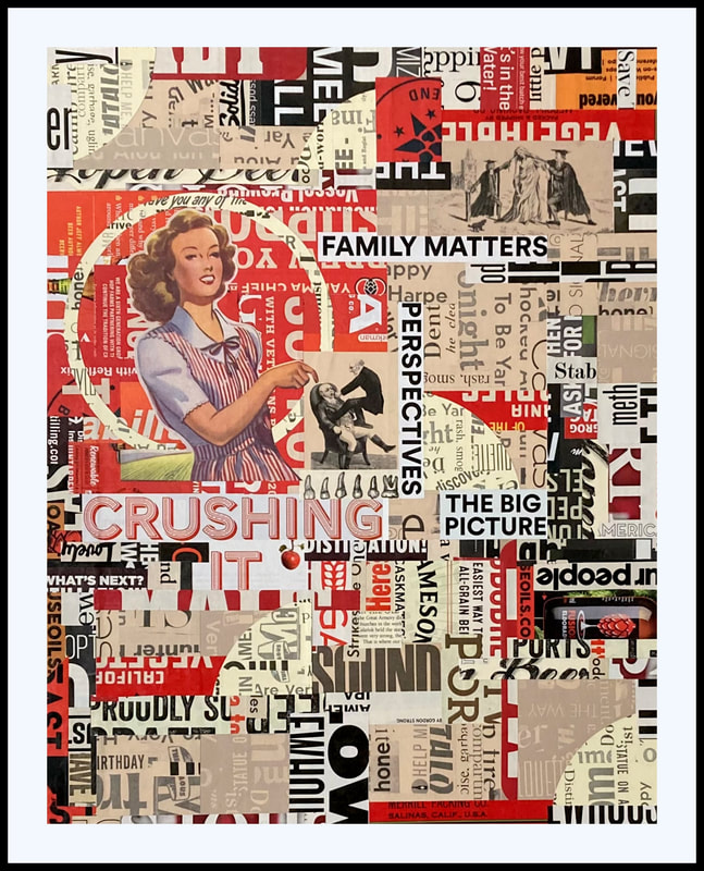   Left to Right: A Closer Look, Family Matters, On Any Given Day, Time To Fly These are all "analog" or by-hand collages with the exception of the one in the lower right which is digital. I am reminded time and again that editing is of the utmost importance. And I think my ability to edit judiciously is directly related to my state of mind. That isn't negative but just truthful. If my mind is muddled or chaotic then the collages tend to follow those states. It's OK though because the collages are all just thinking on paper aren't they? Just my thoughts and ideas which are in the process of being worked out. For the piece in the upper left corner, I wanted to work with scale. Scale of the images primarily but also of the text. The values of the papers are the other variable. It's a lot to juggle but I think this is the right direction. The upper right piece could have benefited greatly from editing and simplification but I also wanted to work with the text and see it as a kind of background. I really love the figure in the circle though so that idea may come back. The bottom two are most successful I think because of the simplification and the editing, to my eye anyway. They are all just little experiments. It's a mistake to think that you can have a formula that gets it right every time. I try not to think that way. The upper left piece is notable for the little figures leaning over looking at the Chicxulub crater. I am excited because I hand colored the black and white image with colored pencil. I think it's a great idea and something that I want to do more of. There's a whole genre of colored black and white photos which I am not interested in. I am wanting to use the method but not in that way. 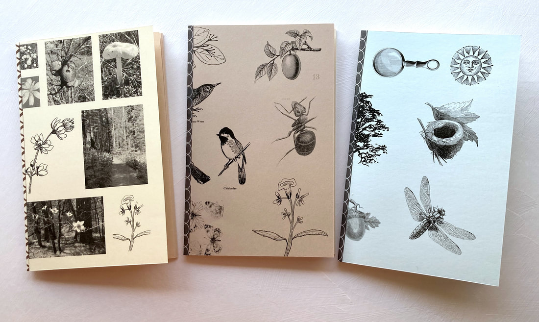 Lastly, I made these little journals. They are about 5" x 7" and are very simply made with cardstock and blank colored copy paper. The images are a mix of my own photos and drawings as well as online images. The pages are stitched to the cover via my sewing machine and include washi tape on the binding. I meant them to be fun little "field" notebooks and had actually intended to offer them to a friend who is teaching a class. I chickened out on that though, feeling that they were to "homemade" to be taken seriously by a real naturalist. I am enjoying using them immensely however. I have been watching the moon and recordings its phases and comings and goings in the morning sky. I take them with me on my walks and am learning how to make fun and better observations of what I see. I had a good time yesterday learning about oak leaves. All of the oak trees look the same to me but once I started examining all of the leaves I could see that they were not all the same type of oak tree. Anyway, it has been a lot of fun to use these.
OK, thanks for reading and as always feel free to contact me with any comments. [email protected]  Family Matters (left) and In The Beginning or The Mysteries of Rudolfo (right) 16" x 20" collage on matboard 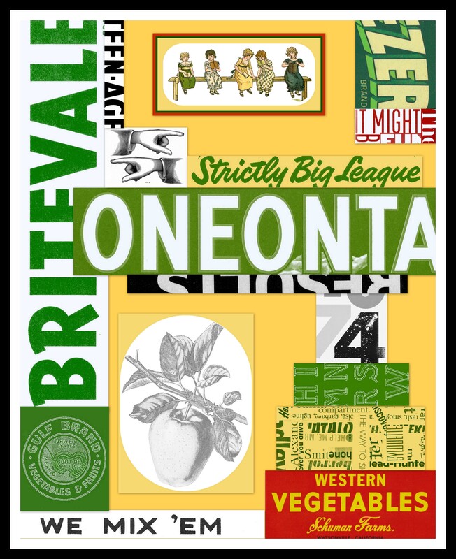  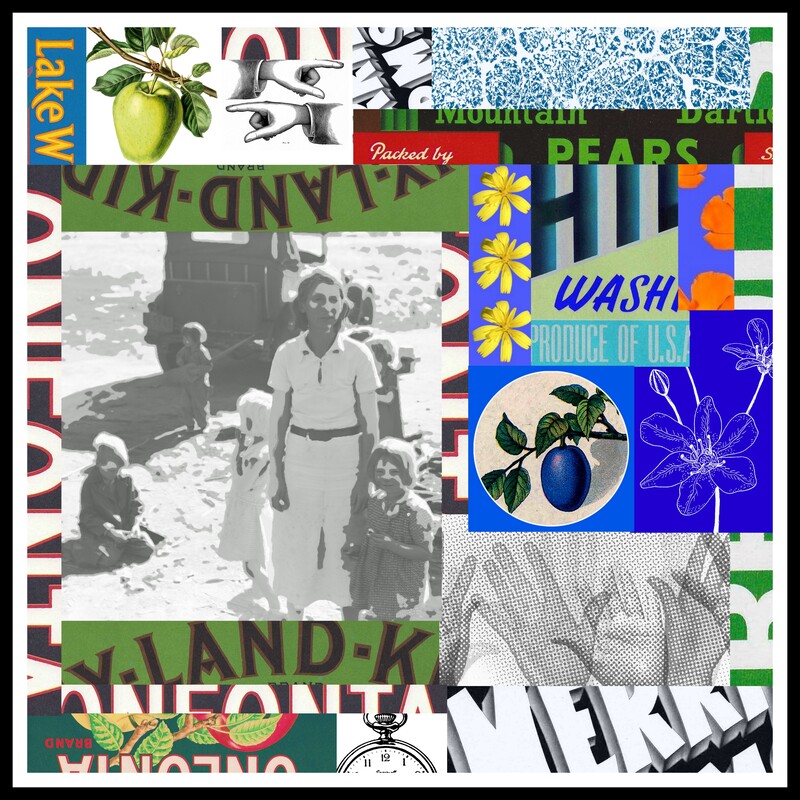 Digital Collages using found and personal papers/photos Well, I would say that officially, I am in some unchartered waters here, for me anyway. Starting with the first two pieces in which I got a bit carried away and then on to the digital pieces where I am learning to use a very basic photo storage program called Picasa to make digital collages. It's just all a big learning curve for me.
For the first two pieces, I let my judgement, usually fairly conservative, about editing fly out the window. I just included all of the things that I thought would work. The first piece, Family Matters, was inspired by some recent interactions with my father and brother. I like phrases and words that can have multiple meanings, hence the title Family Matters. The second piece, In the Beginning, is another collage inspired by family. The main image is of me and my parents on the occasion of my baptism (or is that christening?) into the Lutheran church. My parents must be in their mid to late 30's in the photo (it's 1971 0r 1972). The photo represents my first use of colored pencil in my collages. Also, the drawings of flowers are mine as well. I am always looking for ways to use images that I can easily get my hands on. Things that are copyrighted hold no interest for me so if I can draw or take a photo or get something out of the public domain, I will do it. The next series of images are all digital collages made using the photo editing/storage program, Picasa. I like this method for several reasons. It allows me to store my work on a digital file as opposed to taking up space in my studio. It's relatively easy to use and I can complete an idea fairly quickly. I can also manipulate color and size readily whereas with with an analog collage I am limited to the color of the materials that I have on hand unless I print something (in black and white) onto colored paper. I am also learning how to make photo "circles". The program allows for cropping and rotating and diagonal images as well. For something that is free, it's very versatile. You can even work in layers in a way, if you think ahead a little bit or are willing to backtrack. I did something new too this time in that I made "collage" paper. I affixed bits of text to a base piece of paper and then scanned that in to my computer. That image then became "digital paper" that I can use over and over again in lots of different sizes. I can also use this paper directly by cutting it up and affixing it to the collage or by copying it on to colored copy paper and using that piece of paper instead. You can see the examples in Family Matters and the fourth collage, bottom right. I will admit that I am not that interested in artwork solely driven by technology. There isn't anything wrong with it but it isn't for me. I do like using what is at hand and making those items really work in multiple ways through using very basic technology. An example is that collage paper. It can be turned into any color or combination of colors that I want and used digitally. If I was really ambitious I could pay money to have it printed in color. Or I could buy colored paper, which I have done, and print it on that. This method is also a way to use collage papers that seem precious. Copying them on the printer/copier or scanning them is a great alternative. Lastly, I had the digital images printed through Shutterfly. They look great! I mounted them to foam core board which I really like. They can be easily framed too. I also have some images available here in my Red Bubble shop. Anyway, thanks for reading and as always, you are welcome to get in touch. I am really not on FB much anymore or IG so the best way is email: [email protected] Libby 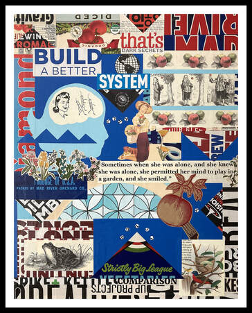 Dark Secrets 16" x 20" Found and painted paper collage This piece was actually completed in March but I am counting it for April!
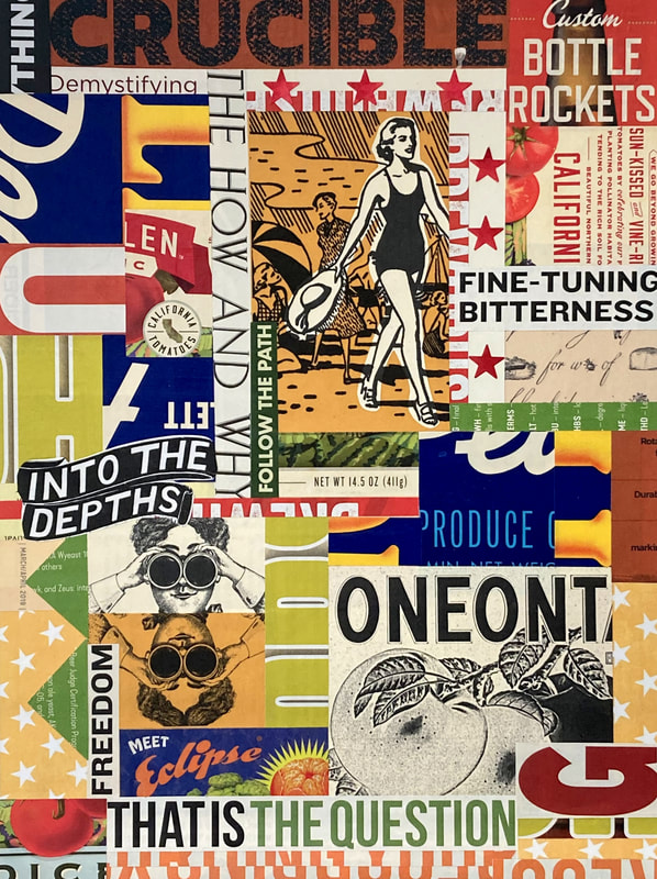
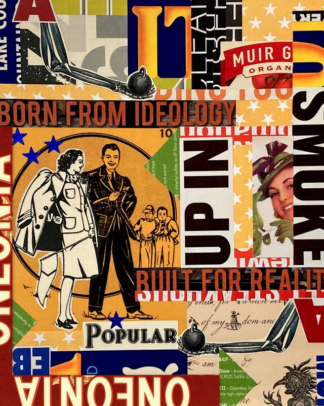
Originally, this was to be a "concept" piece. I wanted to draw on some of my memories from when I was working in a bank many years ago. In the background of the piece is a kind of arch, beige in color, along with some mod looking blue patterned paper. I worked for a bank that had a very mid century modern motif-the owners actively cultivated that kind of look in all of their branches and buildings. The building I worked in was practically an historical landmark-everyone knew the building with the blue roof and arch on the boulevard. Well, the best laid plans... I began to deviate from the idea immediately. I threw in other things and the piece came together. It's crowded, I know, but I don't mind it. It became a repository for what I was thinking about, moment by moment. I am particularly fond of the images in the upper right hand corner. There are three pictures of Sir Isaac Newton contemplating the supposed apple that fell from the tree and gave him the idea for the theory of gravity. I learned that the story isn't substantiated by any evidence. Furthermore, there are many offshoots of Newton's supposed tree around the world. You can't pick any of the apples however. They are meant to be seen on the tree and can only fall off according to gravity. I thought that was pretty funny so I wanted to include the images. I also included a quote from East of Eden, by John Steinbeck. That quote drove some of the selection of the other images which I wanted to have a kind of "natural history" look to them. I like all of the different elements and feel they tie together through a limit on colors-that dark blue, red, cream and black. I think I am on to something here with using color to corral disparate images. I will see how the idea develops. Something new that I am doing is using colored pencils to color black and white images, whether it is an image I find online or one of my own photographs. I struggle mightily to find source material. I dislike spending my creative time looking for a specific image to fit an idea that I have. I often wish I could just draw the image; it would almost be easier. Anyway, I hit on the idea of using my own photos and sketches and coloring them with colored pencils. The pencils are so precise and I love the look of black and white and a little color. I will see where the idea goes. Lastly, the title of the piece does reference the original concept of the collage which was supposed to feature the company that I worked for during my short career. I was laid off in 2007 during the CA housing and mortgage debacle. The company I worked for had been a small mom and pop type of outfit in the beginning (though the business eventually grew to be in several states and became rather large). It came to pass that the owners sold the business and we all ended up working for a bank from back east. That was the beginning of the end. It soon came to light that the mortgage portfolio wasn't possibly as solid as presented. The company was solid in deposits but those mortgages, holy smokes! The whole housing industry fell into the toilet and mortgage lending was turned upside down by the sham mortgages and risky investments that came to light. No matter though. I was laid off and then the new company was sold to wells Fargo. Good luck there is what I say. There is no love lost between me and Wells Fargo. That whole story above that I related is why the piece is called Dark Secrets. Alright, thanks for reading. Until next time. Libby [email protected] 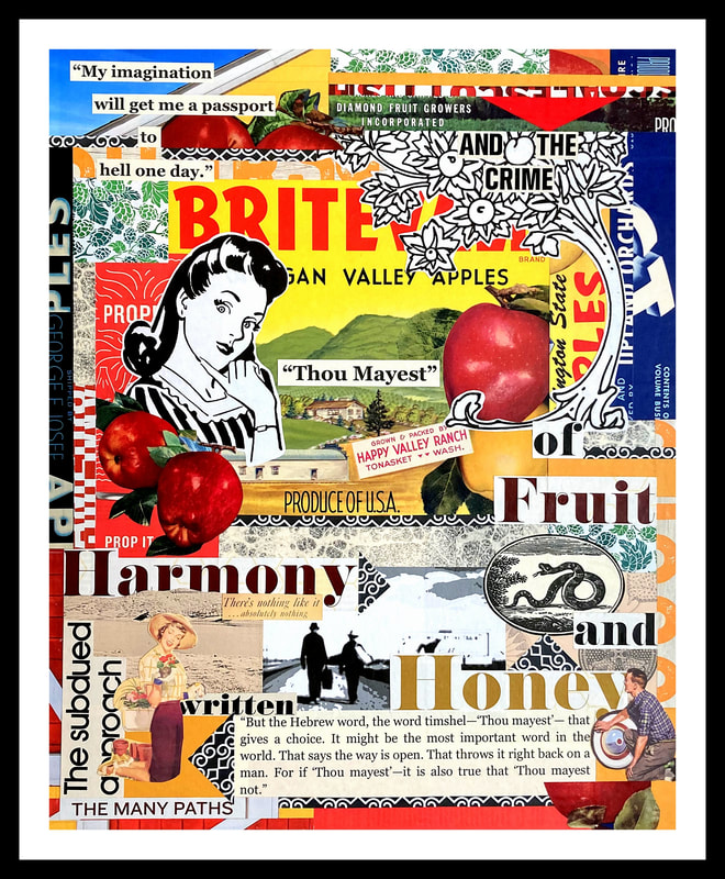 Thou Mayest Thou Mayest (Choices) 16" x 20" found paper collage on board Into The Depths and Up In Smoke collage on board 8" x 11'    Digital Collage 8" x 10" I guess that I love a good cliché as maybe the titles and content of my pieces reveal. Or maybe I am drawn to age old stories or a kind of nostalgia surrounding outdated stereotypes. Whatever the case may be, I would argue that ideas themselves never go away even if the times change and new ways of thinking and acting come into vogue. There is a constancy to things, to history, and to people. We do study ancient cultures and past historical events just as much as we focus on modern day people and happenings. I think, for better or for worse, we can't get away from ourselves and our history.
I just finished reading East of Eden by John Steinbeck. Prior to, I had only read The Grapes of Wrath. Honestly, I thought his books were for boys or something when I was in high school and then as a younger adult I was turned off by Steinbeck's material and maybe even that he was a macho seeming kind of guy. It's a good thing that I found this book at the thrift shop a few months ago (just $2 can you believe that?) because this is a gem of a story. It's not really even the story so much, though it is good (it's a retelling of the Genesis fable) but the characters. I got about a chapter into the book when I realized that Steinbeck's absolute skill was in the character building. Wow! I became entranced with the whole thing and couldn't put the darn book down. The story is an epic and the characters memorable. I was particularly drawn to the Samuel Hamilton character; his interactions with the different characters, his thinking, his language, all of it. There is one scene in which he and two other characters are discussing man's ability, his option, to choose between good and evil. This is one of the main themes of the book and it hinges on, among other things, this discussion between the three men. It's a riveting scene. I read the book as I was working on the above pieces (not at the same time, not simultaneously of course!) and was very influenced. I found myself searching for images and words and phrases that reflected my own ideas relating to the book: good and evil, original sin, men and women and the roles that they have been assigned throughout history, and history itself, specifically the very early 20th century and then the Dust Bowl years. I never thought I would be the type of artist who works with text and images. Maybe it's a new opportunity. And speaking of new opportunities, I wanted to mention that I now have some items available for purchase in my Red Bubble shop. The shop is listed under my name, Elizabeth Fife, and the link can be found here. I tried to list items that could be worn (and then recycled) or that were paper based (and could be recycled/reused). There are also magnets, phone and tablet cases, and buttons available. I get that people have a lot of stuff, that they are sick of stuff. I am too. But, it doesn't hurt to have something fun in your life either. I ordered a shirt for myself as well as a "test" print mounted on matboard. There are only a few designs available for now. I selected the digital images for this idea since they provide the best clarity for reproduction I think. we will see where this goes. If you take a look let me know. February is almost over and I hope to get on to some new work. The digital collage idea is very exciting for me though it is a little more time spent on the computer. I am using a very rudimentary program from Google called Picasa. It's doing the job for now. I almost like working within it's constraints. I see it as a challenge and an affirmation that art making doesn't need to be expensive or complex. In any case, thanks for reading and looking. Please feel free to send me an email if you would like to comment or catch up: [email protected]. Libby 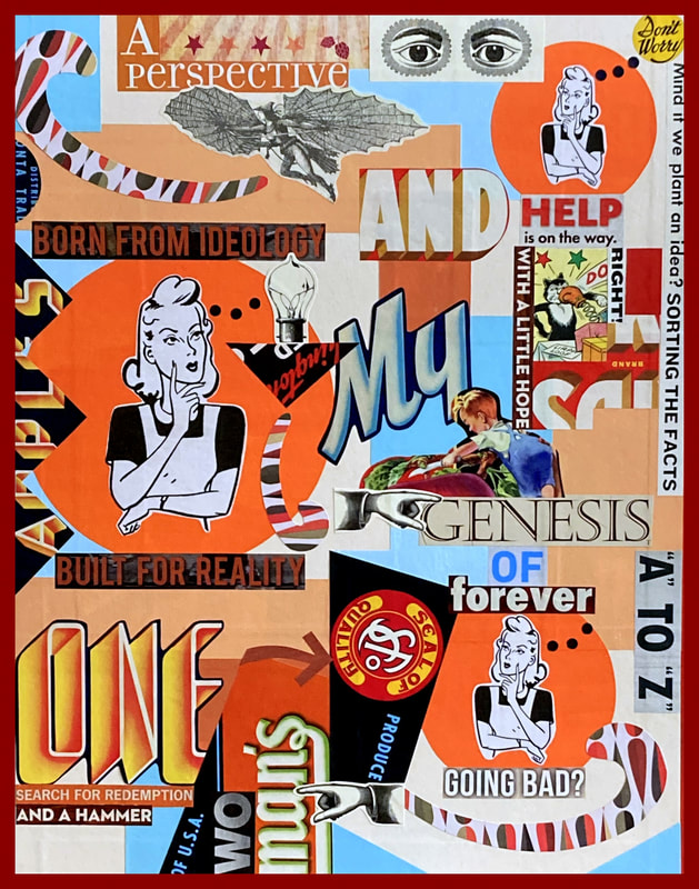 Going Bad 16" x 20" painted paper collage painted and found papers on matboard 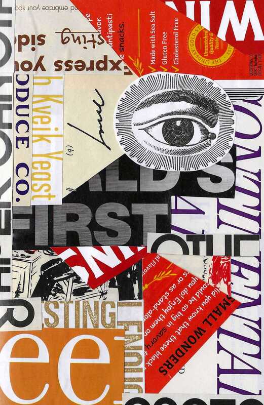 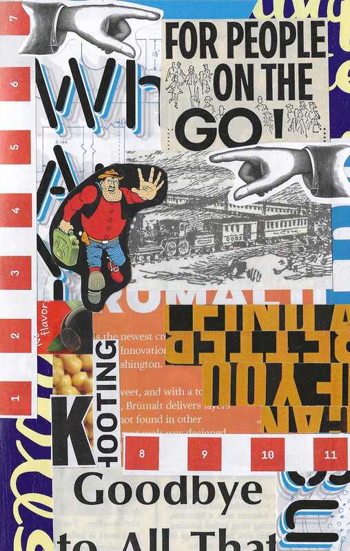  
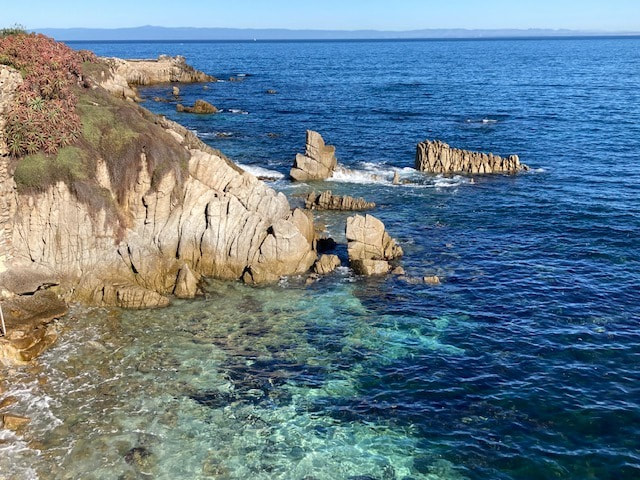
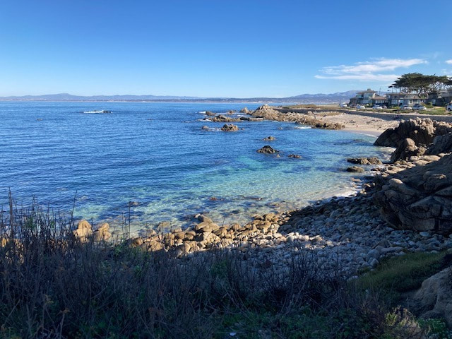
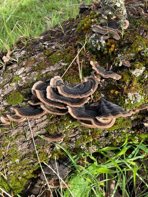
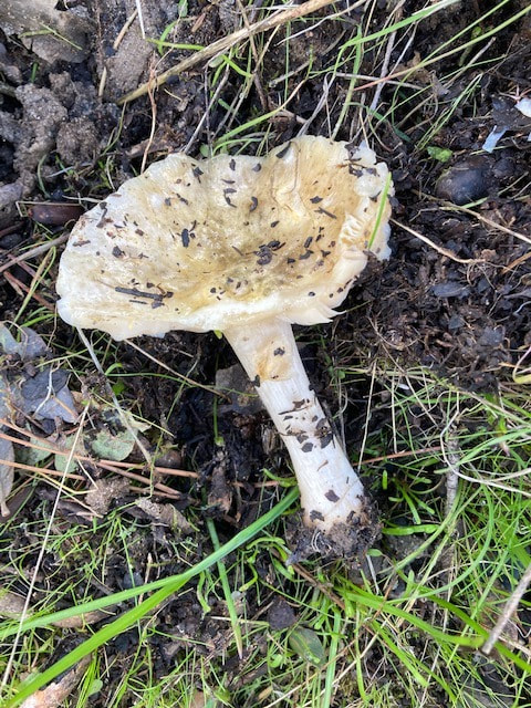
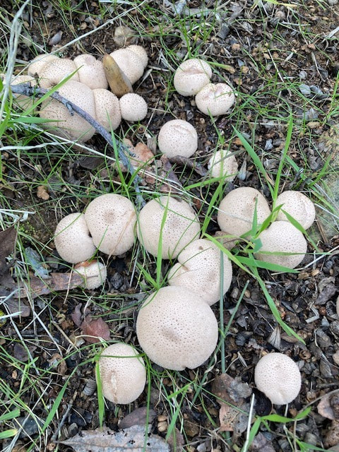
Hopefully January is finding people happy and productive. 2021 was just so damn hard that I sincerely hope 2022 is off to a better start for folks. I wanted to share the above finished piece and sketches. I will start with the sketches first which are the smaller pieces shown directly above. I can't say enough good things about working in a sketchbook. When you can't go big as they say, there is no need to go home (as also suggested). Just go directly to your sketchbook! This advice really applies to anyone and any venture that they might be engaged in, creative or otherwise. Often times life is about going through the motions. Something very small is more manageable at times than something very big. If you can get going on just one small thing, then that small thing might snowball into something else. The point is to just keep going; keep feeling vital. Like others, I sometimes don't feel up to a huge project. A small sketch might just take a portion of my morning as opposed to a week or two like the finished collages that I make. The sketches are very gratifying in that they keep me moving forward. If I don't like them it doesn't matter much. I can easily do another one. It isn't really that I take an idea that I like either and make it larger with the larger pieces. I just think that working consistently on something keeps the tracks in your brain clear so that when that big train does show up, well, the path is open, to let that train through. (Maybe metaphors aren't my strong suit but what the Hell!) The finished collage (first pic shown above) was quite a nice surprise for me. I really want to share some of the elements that made it come together. First, I re discovered a free graphics site and explored and downloaded some of the images (that's where the picture of the woman came from). I also inadvertently figured out how to reverse an image while using Microsoft Word. Fruit crate labels have become a new favorite thing for me and I have been using portions of the images and the letters. My friend, Carol, also gave me some fun playing cards with cartoon images and so I have been using those as well. And lastly, my husband has been kind enough to let me cut up some of his magazines. There are all sorts of great graphics in the magazines that have been really fun to try and use. Using letters and words in my work is something I never imagined doing. I am just not the kind of artist who presents a message, written or otherwise, though I know many artists do. I am not really good either with memes and sayings and feel good messages like you might find on FB or IG. They just don't speak to me. But, I love text and images and all sorts of graphics. And I love puzzles. So, with that said, when you cut up text and rearrange it or when you isolate colors and images from a magazine page, that's just a horse of a different color! I absolutely love that you can take something out of context and do something else with it entirely. That really appeals to me. So, the challenge for me is to make something visually pleasing that isn't too busy or fussy. I want to apply what I like with my other collages to these new pieces that use words and letters and images. I haven't a clue what I am doing most of the time but using my own design ideas helps guide me. It's been very fun so far. Lastly, I have some photos to show. I went on vacation to Monterey late last year. I have also been on lots of walks at my local lake. Additionally, I have become smitten with all things fungi related (I am taking an online webinar). So, I have some images of mushrooms from my own yard and from my walks. Don't ask me what the fungi are, I have no idea! I changed my website format a bit. The menu bars are now on the left upper side. I know my site looks dated but that will have to do for now. I imagine eventually the Weebly/Square Space will no longer suit me and I will hem and haw and be aggravated and then do something different. We will see. In the meantime, if you are reading and would like to pass this newsletter along to a friend, please do so. It would be nice. Also, if you want to drop me a comment or communicate, please send me an email directly: [email protected]. Please don't leave a comment here as I don't get notified even though I have opted to do so. I am sure it's a Conspiracy of some sort.
Thank you for reading! |
Archives
July 2024
|